Gateway dashboard
The Adhese Gateway dashboard provides a comprehensive overview of various segments, including up-to-date information related to your real-time bidding (RTB) revenue.
It is crucial to keep in mind that this dashboard comprises unprocessed data. The reported revenue and impressions should be regarded as estimated values and may differ from the final reports. The dashboard is helpful for keeping a finger on the pulse of inventory activity and revenue from RTB.
To reach the Gateway Dashboard, append /tools/dashboard to your accounts url.
ex.: https://accountname.adhese.org/tools/dashboard
Dashboard
Introduction
The dashboard is intended for operational use. It provides an overview of market performance in real-time, enabling users to identify any changes to their Gateway setup. The screens are divided into various panes, which are described in more detail below.
Overall View
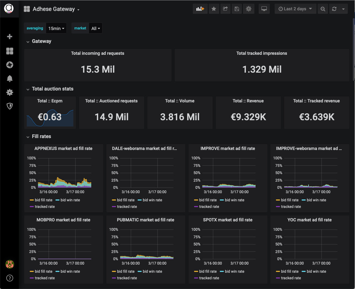
Gateway
Contains the overall total of incoming Ad requests and Tracked impressions.
Tracked impressions are “win notifications” triggered by the client (browser or app) when an advertisement is rendered.
Total auction stats
Fill rates
The fill rates pane contains a chart per Market plotting three percentages over time. The charts give insight into how frequently a market bids, how often those bids win the auction, and how often the bid eventually gets shown to a user.
- **Tracked rate: how many won bids were eventually shown and tracked on the page. When a bid is won, it doesn’t always get visualized on a page. Depending on the website or app’s implementation, bids may be collected before the actual page is visible. We add a unique tracker to a winning bid to create insight into the amount of winning bids that eventually get shown. This tracker will be called when the user reaches the part of the page where the advertisement is displayed. The number represented here should be close to the amount of “Paid Impressions” reported by the SSP’s or DSP’s in your dashboard.
Per Market statistics
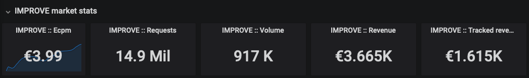
For each active Market, five numbers are reported:
Inventory View
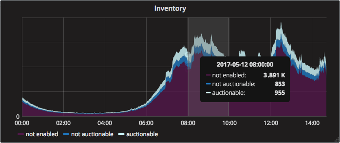
The Inventory View consists of three charts, giving you insight into what portion of your inventory goes into auction and how much of your traffic has a user ID assigned to it.
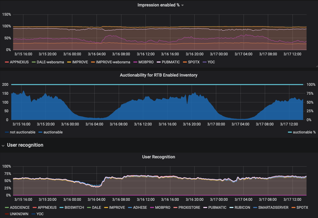
Impressions Enabled
For each Market, a percentage indicates the amount of traffic (all formats combined) configured and sends out bid requests.
Auctionability For RTB Enabled Inventory
Depending on the “RTB Compete” feature of Adhese Direct campaigns and bookings, direct impressions can be set.
User Recognition
For each Market, a percentage indicates the number of Bid Requests that contain a UUID recognized by the Market.
Technical View
The technical view presents three charts giving insights into latency, errors, and timeouts.
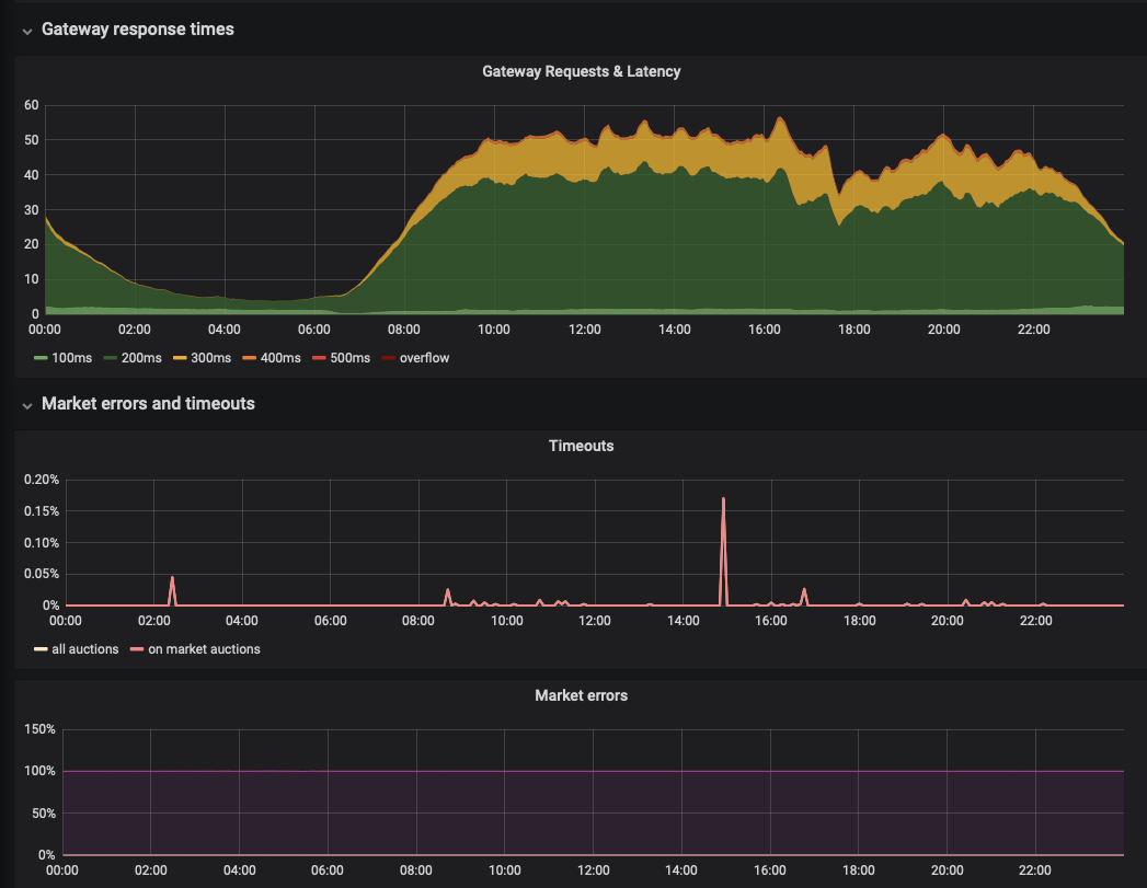
Gateway Requests & Latency
The Gateway Requests & Latency graph presents the latency in milliseconds for all requests that pass the Gateway. A tooltip shows the number of requests with their respective latency when hovering over the chart.
Timeouts
The Timeout line chart shows the percentage of timeouts for all auction and bid requests and the selected period.
Market errors
The Market errors line graph shows the percentage of errors for each involved party.
Actions
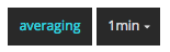
Averaging
All figures in the interface are averages. You have the option of averaging the numbers according to a period of 1 minute, 5 minutes, or 15 minutes. To select your preferred averaging period, click the averaging button located in the upper left corner of the interface and choose a period from the list.
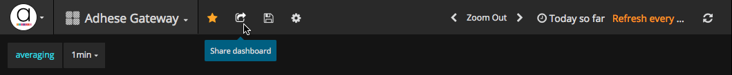
Sharing
Expand
The dashboard is divided into several sections, including Auction revenue, Prices, and Technical. All sections are expanded by default. To hide an expanded section, click the downward arrow next to the section’s title. To reveal a hidden section, click the left arrow next to the section’s title.
Timespan
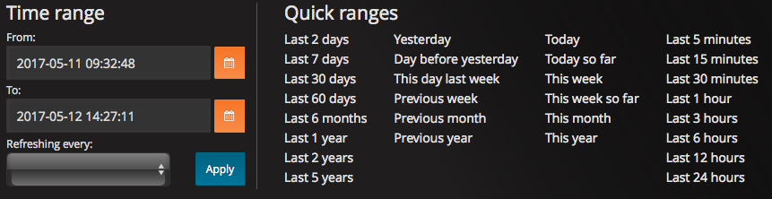
The dashboard period can be modified to reflect the most recent data, which can be taken into account in various ways.
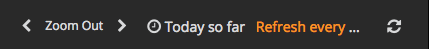
In the upper right corner of the interface, you can change the period by:
- Shifting the time span backwards. To do so, click the left arrow.
- Zooming out the time span. To do so, click Zoom out.
- Shifting the time span forward. To do so, click the right arrow.
- Clicking the selected time span. A list with several options appears where you can manually change the time span or quickly choose a time span.
The dashboard's time span can be modified by selecting a time range from a chart within the dashboard interface. To select a new, shorter period, simply click on the chart, hold your mouse and move to the desired start or end date. As an example, in the following graph, the time span is being changed from 00:00 - 14:45 to 08:00 - 10:00.