
Lookerstudio Report Example
Lookerstudio reporting is a custom feature that requires some implementation work. Please contact support if you want to make use of it.
For more customisable reporting than is available within Adhese itself, we can provide our clients with Lookerstudio reports based on date exported to BigQuery.
In this page, we will give an example from our own marketing account.
Note that this is a fairly simple report and that every client's report can differ based on the metrics configured to appear in the reporting on Lookerstudio.
Report Overview
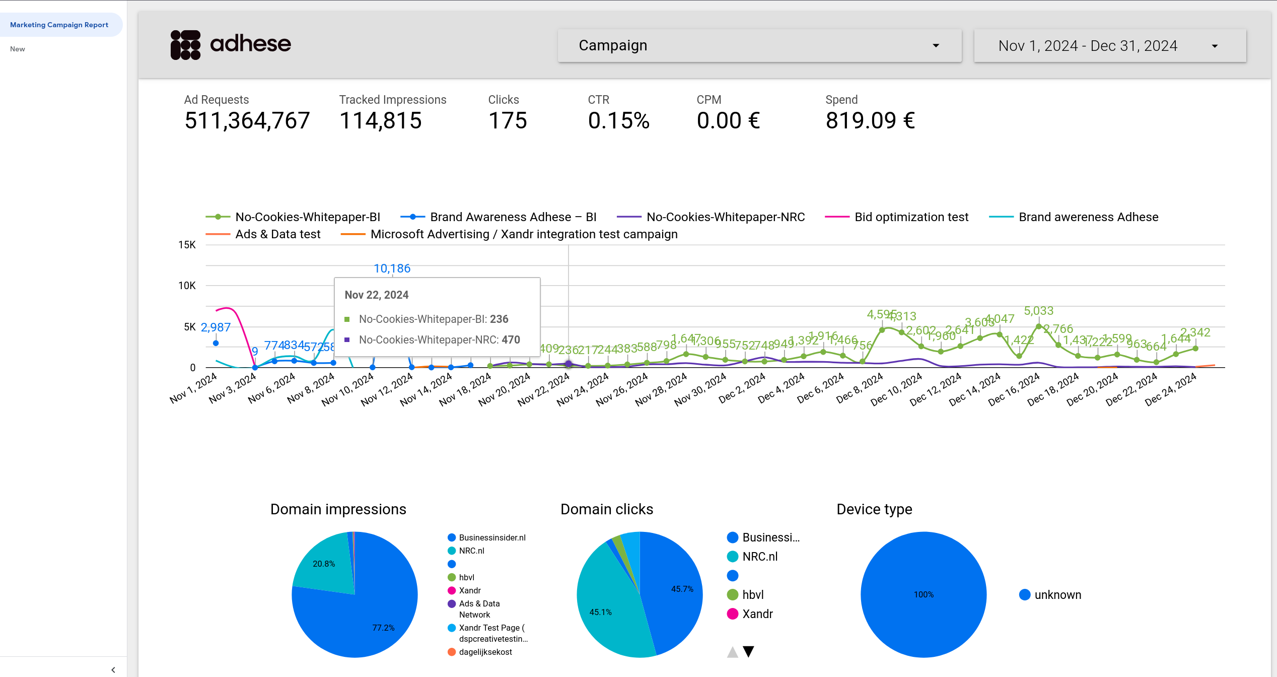
In our Adhese marketing report, we have two filters at the top, metrics for the filtered campaigns and time period below the filters.
In the middle you have a historical graph of the amount of impressions per campaign and below pie charts with metrics on the distribution of impressions, clicks and device types. If you hover over the pie charts you will see exact metrics:
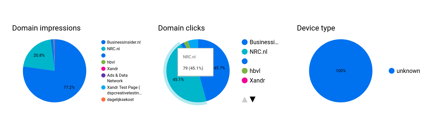
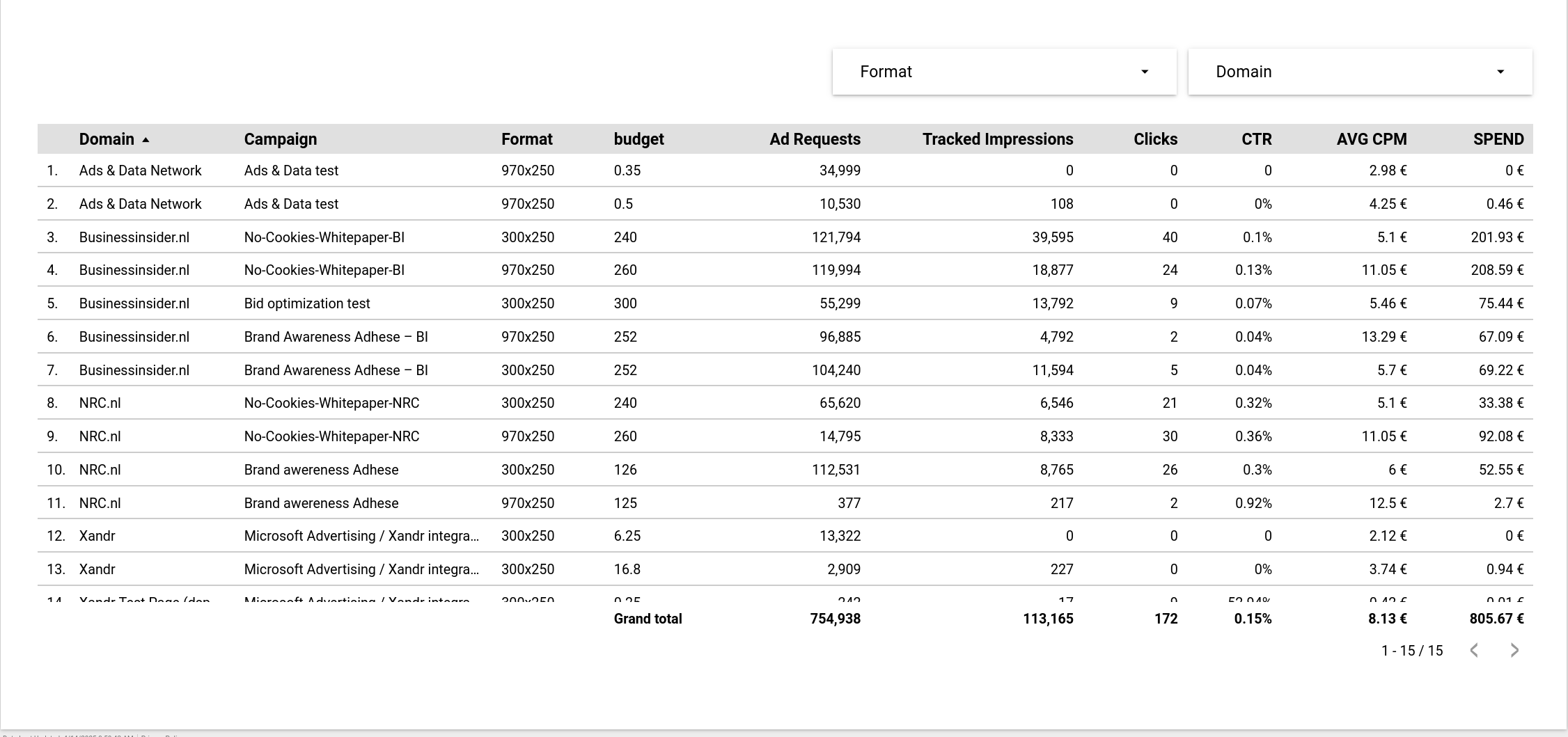
Below the pie charts we have a table overview of various metrics by domain, campaign and format combination.
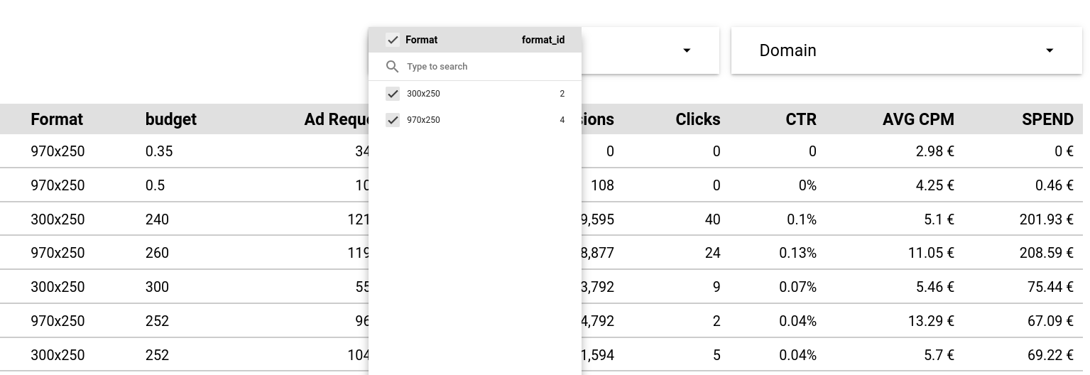
You can filter the tables based on what formats and domains you want to see.
Report Filters
You can filter the report either by campaign or by date with the filters at the top of the page:
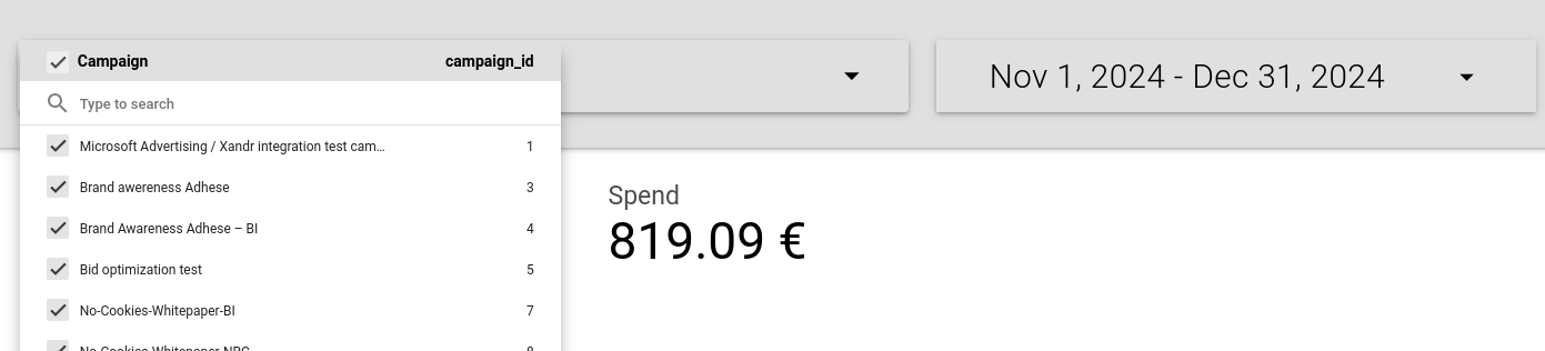
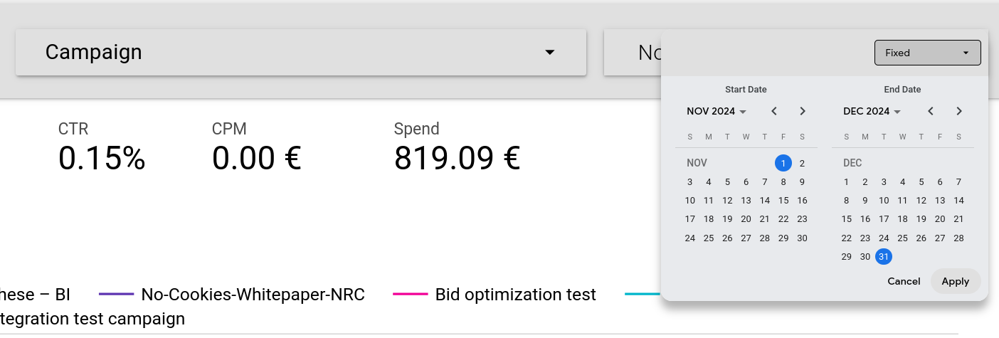
The metrics at the top and data displayed will change to reflect your chosen filters.
No comments to display
No comments to display